A good link tells you exactly what it does, even if you just read the link by itself. The idea is to avoid vague words like “Click here”, “Shop now” or “Read more” because they don’t give you any information out of context. Let’s talk about WCAG 2.4.4 Link Purpose (In Context) from a Design perspective.
Let’s give an example
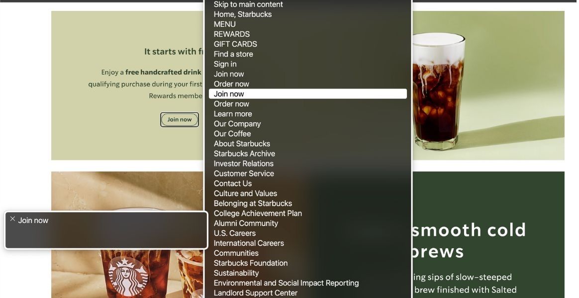
Below you will find the Starbucks homepage with a link that says “Join now”. What’s the problem? Well, the link makes no sense in isolation.
“Join what now?”
Some users navigate using the links only, below is what a screen reader user might hear using VoiceOver.
Notice how “Join now” is a standalone piece of text in a sea of other links. It’s not clear what “Join now” relates to. Making your links clear and descriptive helps everyone, especially people who use screen readers.

OK, but what’s the fix? What should I do?
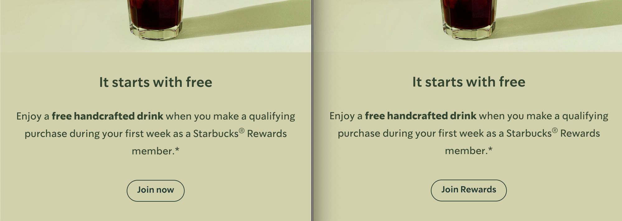
It’s simple, it’s a Content Design problem. Simply updating the Content so the link make sense in isolation. For example this has now been changed from “Join now” to “Join Starbucks Rewards Now”

I don’t like how this looks though, it’s too long and looks ugly
I hear you, but is there a better phrase you can use? Shorter text? Instead of “Join Starbucks Rewards now” how about “Join Rewards”

Maybe, I don’t care though, everyone does it
I get that change can be difficult, Accessibility actually pushes us to create better, more innovative designs for everyone. It forces us to solve problems we might not have considered otherwise. It’s not about changing for the sake of it, but about making a product that works for more people, which is an upgrade in Design.
Can’t you just add a fix in code?
Here’s the thing, Frontend can, and often does add a fix. There are workarounds that can resolve this issue from a code point of view. However, this is why this is not ideal and actually is a Design problem that needs a Design solution.
The code workarounds provide more context to the user, so they might see “Join now” and hear “Join now, Starbucks rewards” so there’s this disjointed mismatch between what the user sees and what they might hear. Some users that use a screen reader can also see the screen.
Additionally, now there’s more code to maintain, more code to test, there’s an additional step now to ensure that the link is linked to something else, the headline to ensure this particular WCAG criteria is met. The European Accessibility Act (EAA) is active in many countries meeting WCAG 2.1 AA is now a legal requirement. It’s a simple change resulting in an Accessibility upgrade.
Further reading
- This post was featured on TGPi, Weekly Reading List August 18 2025
- Why “click here” is a terrible link, and what to write instead
- Why Your Links Should Never Say “Click Here”
- Link Text & Accessibility: What Leads to a WCAG 2.4.4 Failure?
Want more simple, actionable tips? I’m Chris, a UX Developer with a focus in accessibility, available for hire.