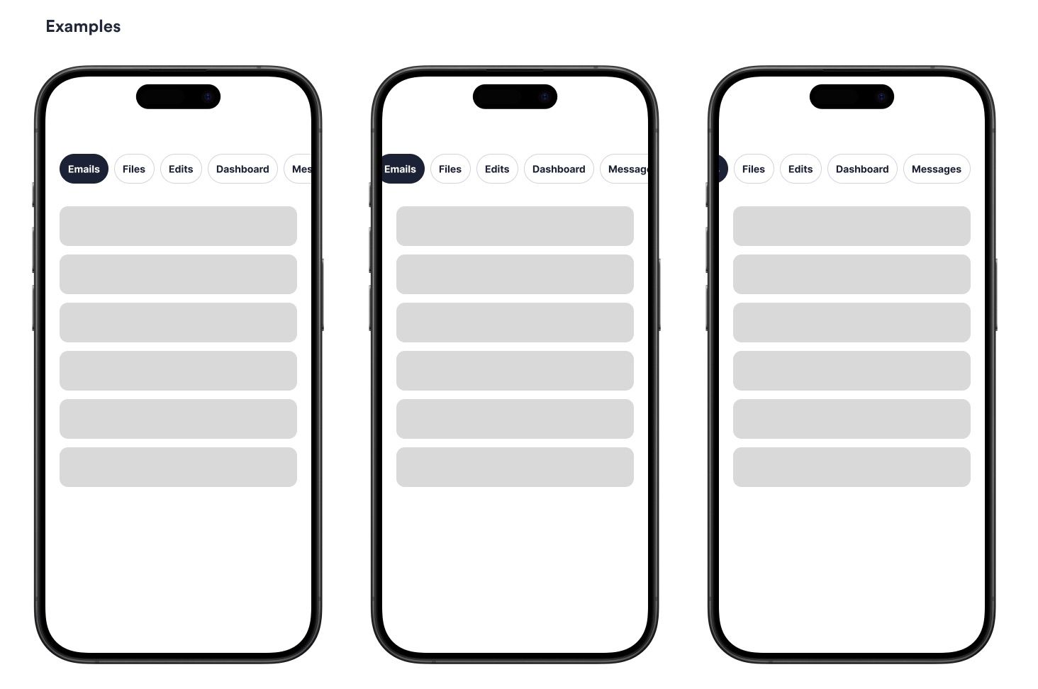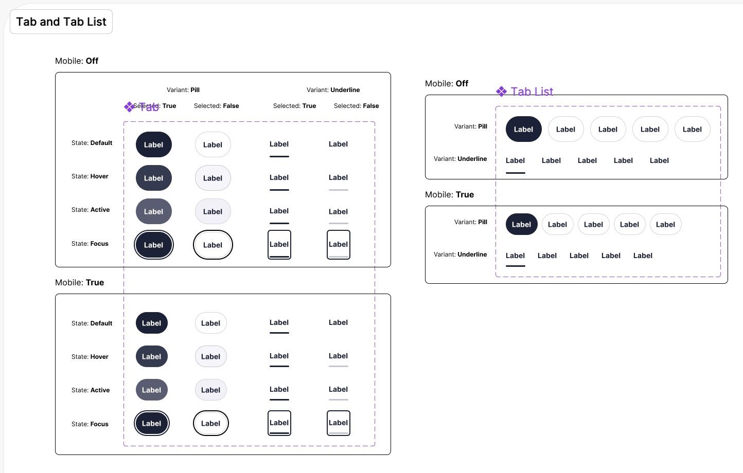
Starting with this Design what was notable was this is composed of three different components. First there is this Tab Button, so it functions and looks like a Button but is actually a Tab for this pattern.
Next you have a Badge that is nested with this Button, an optional visual element to add Context, maybe a status.
Design Review

First things first, setup all the Design Variables (or Tokens) that apply to this new Design. Luckily a detailed Figma was provided and many of my Design related questions were answered. Typically when working with Designs some common questions that might be missing from the Design include:
- What are the active and focus states of this element?
- What is the spacing on various screen sizes?
- What is the keyboard interaction of this element?
- Does it pass colour contrast checks?
Sometimes these unanswered, however in this case these were detailed.

Taking a deeper look at the Design. There were some issues and questions:
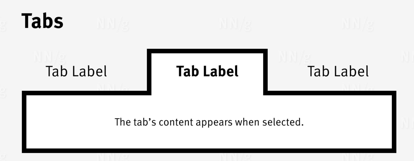
- This isn’t really a
TabDesign, visually tabs tend to merge into the tab panel rather than be a floating button. Why has this particular Design been prioritised above the traditional pattern? - What does this look like before progressive enhancement (or what is fallback version)?
- What are the headings for this page?
- What should Assistive Tech hear when it reaches the badge, to give context?
- Why is the keyboard order not annotated?
- What happens to the
Badgewhen various states are active (eghover,focus)?
Design issue
Why a Button and not a Tab?

The scrolling Design of the Tab system suggested that the horizontal scroll bar should be removed. Ideally this would have been considered in a bit more detail, perhaps adding scrolling arrows or animations to indicate clearer to the user that this element could be scrolled. It’s following the “peak or overflow” Design solution.
However this also speaks to the component use in general, should so many Tabs be in use that an overflow is needed, then the Content probably needs a rethink. It’s not taking a Content-first approach? Where is the Content? What is this supposed to “tab-ify” and more importantly, why? Tabs ideally should be used as a last, justifiable, choice. In the first step it would be to redesign the Content so it’s not even needed.
The hover states and borders could have been darken as well to fully pass colour contrast checks, for low vision users, however as not a WCAG 1.4.11 fail, just something to note.
Consistent Identification, WCAG 3.2.4
Also, why are there different styles? An “underline” and a “pill”?
Ideally this should be revised and one chosen. The underline Design more closely resembles a link, which this Component isn’t - it’s a Button (and should be a Tab) There’s probably a conversation needed about what qualifies to go into the Design System and if a team needs a variant they would need to strongly justify it, ideally with data.
(Narrator: there wasn’t any data…)
This type of variant creates inconsistency for the same pattern, which can easily be an accessibility issue under WCAG 3.2.4. This could speak to an organisational issue where teams want “all the variants” and rather than think a bit deeper if this is actually needed.
UI patterns that do the same thing, should look the same - otherwise it creates unnecessary cognitive load. Think of users that have learning difficulties, patterns should have consistent identification.
Architecture
Next some time was spent thinking about the architecture of these elements and the best method to structure the Design System in this context.
I quickly settled for the Badge being be imported into the Button / Tab and then this would be used on a new Tabs Component. Mainly as these are different isolated elements that qualify for Component criteria and could be reused.
The Badge lacks context, of why it’s being used, how it’s being used. It wouldn’t qualify as it’s own Component yet as much is unclear. However code-wise it makes sense to isolate this, for now.
I could also see this Button / Tab being expanded for Button use in general. This had the potential to be a dedicated Design System Button with the Tab variation being a prop that was switched on and off during the Tab component use. However in this context, this was out of scope to think about of variants of Buttons. However I would expect other Buttons to look very similar if not the same.
General Development
Stack - Storybook
Storybook was noted to be in use, this is quite a common tool when implementing a Design System, mainly as it takes what has been built in an SPA (Single Page Application) and lays an interactive interface to be able to display this pattern and Components in an easy way.
I don’t always think it’s needed for smaller projects, I think you could get by with just the elements just on a page. I’ve often seen Storybook setup, but not maintained. Also, I noticed that the Accessibility tab is not built-in by Default within Storybook but this is a first party plugin. Not sure why it’s separated out.
What is pnpm?
This project used pnpm, this was my first time seeing this wondering what is it, why it’s used. My short takeaway is that it’s similar to npm, yarn but with other features / pros and cons. Practically for this project is just meant that i’m using a slightly different CLI command.
pnpm is a fast, disk space-efficient package manager for JavaScript and Node.js applications, similar to npm and yarn, but with some unique features and optimisations that make it particularly useful for larger projects or monorepos. It stands for “Performant npm” and was developed to address some of the limitations found in npm and yarn.
Pros and Cons of pnpm
| Feature | pnpm | npm |
|---|---|---|
| Disk Space Efficiency | ✅ Efficient with centralised storage using symlinks, saving disk space (especially for monorepos) | ❌ Each project has its own node_modules, which can lead to duplicate package installations |
| Installation Speed | ✅ Faster due to caching and symlinked storage | ⚠️ Slower, especially in large projects, as packages are duplicated across projects |
| Strict Dependency Isolation | ✅ Enforces strict dependency tree to prevent issues caused by conflicting versions | ⚠️ More flexible but prone to “dependency hell” with nested packages |
| Monorepo Support | ✅ Built-in support with pnpm workspaces, optimised for large codebases |
⚠️ Limited support; workspaces are available in npm 7+, but not as optimised as pnpm |
| Compatibility | ✅ Compatible with package.json and .npmrc, allowing easy switch from npm |
✅ Default package manager for Node.js, widely supported |
| Dependency Management | ✅ Faster resolution with strict peer dependency handling | ⚠️ npm has improved dependency resolution but can still lead to issues with version mismatches |
| Community and Ecosystem | ⚠️ Growing community; not as widely used as npm, but gaining popularity |
✅ Large, mature ecosystem with extensive support and integration |
| Lockfile Handling | ✅ Uses its own pnpm-lock.yaml with efficient file format and dependency resolution |
✅ Uses package-lock.json, fully integrated with npm |
| Learning Curve | ⚠️ Slight learning curve, especially if new to symlink-based management | ✅ Well-known and familiar to most developers |
| Default Configuration | ❌ Requires installation (npm install -g pnpm) |
✅ Comes preinstalled with Node.js |
| Error Debugging | ✅ Better error messages and reporting for dependency issues | ⚠️ Sometimes unclear error messages in dependency issues |
Stack - What is Vite?
I’ve used Vite before but I started to wonder, whats the history of this tech.
“Vite (pronounced “veet”) is a fast, modern build tool for web development, primarily focused on frontend projects using frameworks like Vue, React, and Svelte. Developed by Evan You (creator of Vue.js), Vite’s main goals are to improve the development experience by making it faster, simpler, and more efficient than traditional bundlers like Webpack or Rollup.”
Maybe not 100% accurate but similar to Webpack, Parcel, I was wondered what’s the difference between Vite and Rollup. turns out Vite uses Rollup internally, ok so it’s building on this.
Accessibility considerations
My starting point was to take a look a the recommended Tabs pattern from W3C
The spacing within the Design suggested was all pixel based, this was adjusted to use relative values using a simple mixin, this ensured that testing for Zoom 300% was working as expected. Due to relative values being used, this was also working on zoom-text-only for Firefox addressing Reflow WCAG 1.4.10 criteria. Should a user decide to zoom in, say to see better, they’ll be able to interact and view the pattern in the expected way.

Failed to consider Progressive Enhancement
Unfortunately with this stack if JavaScript doesn’t load the entire thing fails to render. You would expect this to fall-back to HTML, remove all the JS perhaps just be a simple page of Content with each tab being a header and the inner Content being a paragraph.
The React ecosystem has rebranded progressive enhancement as SSR (server-side rendering) but this was not setup or perhaps valued on this project.
It does change the Development approach, firstly the Design of this view has not provided, secondly the markup would be more basic factoring in this requirement, this would be enhanced to update this to the final Tab Component markup. At this point the markup of ul li simple acts as an indicator to the Developer as it would never render these.
Consider what has been delivered:
<div>
	<h2>Menu</h2>
	<ul>
		<li>
			<button>Button text</button>
		</li>
	</ul>
	<div>
		<div>
			<p>Content</p>
		</div>
	</div>
</div>
Compared to practising progressive enhancement:
<div>
	<h2>Menu</h2>
	<div>
		<div>
			<h3>Button text</h3>
		</div>
	</div>
	<div>
		<div>
			<p>Content</p>
		</div>
	</div>
</div>
Keyboard interactions
What should the keyboard do? When interacting with a tabbed interface, here’s how each key should behave:
When a Tab is activated, the focus is set to the button. Ensure that the focus is also managed correctly when navigating with the keyboard. If a user navigates using the arrow keys, the focus should move to the newly activated tab
Tab Key
- Initial Focus: When you first tab into the
tablist,focusis placed on the activetab. - Tab Navigation: Pressing
Tabmovesfocusout of thetab listto the next interactive element on the page (often thetabpanelor the actual Content, the first focusable element within it). Arrow Keys(when focused on atabin a horizontaltablist)Left Arrow: Movesfocusto the previous tab. Iffocusis on the firsttab, it cycles to the lasttab.Right Arrow: Movesfocusto the next tab. Iffocusis on the last tab, it stops.- In this context, these keys can also activate the newly focused tab (i.e., open its associated
tabpanel) as soon asfocuschanges. - Activation Keys so
SpaceorEnter: Activates the currently focusedtab, opening itstab panel(if it wasn’t already activated when focused, which it is in this context.
Navigation Shortcuts, these are optional but added:
Home: Movesfocusto the firsttab. Optionally, it also activates thetab.End: Movesfocusto the last tab. Optionally, it also activates thetab.
What’s the markup?
Taking a look at the pattern, the semantic html elements for this pattern don’t quite offer what is needed. aria is recommended for this. Going through it and making sense of the what and the why.
Key Roles and Properties for Accessibility in a Tab Interface
Tab List Container (role="tablist")
- What: The element that wraps all the tabs should have
role="tablist". - Why: This tells screen readers that this is a container holding a group of related tabs.
Individual Tabs (role="tab")
- What: Each
tabin the tab list hasrole="tab"and is placed inside the tablist container. - Why: This tells assistive technology that these items are tabs and part of a set, allowing users to navigate between them.
Content Panels (role="tabpanel")
- What: Each section that displays content when a tab is active has
role="tabpanel". - Why: This tells screen readers that this element contains the content for a
tab, helping users understand the structure and focus on the active panel.
Labelling the Tab List (aria-labelledby or aria-label)
- What: If the tab list has a visible label (like “Settings” or “Profile Tabs”), the
tablistshould usearia-labelledbyto reference that label. If there is no visible label, we can usearia-labelontablistto give it an accessible name. In this context it’s not needed as the inner Content provides thearia-label. - Why: This provides context, so users know what the tabs are for (e.g., “Profile Tabs” tells the user this area is about profiles).
Linking Tabs to Panels (aria-controls)
- What: Each
tabshould havearia-controlsthat points to thetabpanelit controls. - Why: This explicitly links each
tabto its content panel, improving navigation for screen readers and making it clear which panel belongs to which tab.
Active Tab (aria-selected)
- What: The currently
active(selected) tab hasaria-selected="true", while all other tabs havearia-selected="false". - Why: This informs screen readers and users about which
tabis currently active, making it easier for them to follow along with the interface.
Linking Panels Back to Tabs (aria-labelledby)
- What: Each
tabpanelusesaria-labelledbyto reference the tab that activates it. - Why: This link makes it clear which tab each panel is associated with, helping users understand and navigate the tab structure.
The Button Component ended up looking like this
import Badge from '../badge/Badge';

interface ButtonProps {
	id: string;
	ariaControls?: string;
	label: string;
	disabled?: boolean;
	onClick: () => void;
	selected?: boolean;
	variant?: 'pill' | 'underline';
	badgeVariant?: 'neutral' | 'positive' | 'negative';
	badgeLabel: string;
}

const Button = forwardRef<HTMLButtonElement, ButtonProps>(
	(
		{ ariaControls, label, onClick, disabled, badgeLabel, badgeVariant, variant, selected },
		ref
	) => {
		return (
			<button
				id={`tab__${label}`}
				role="tab"
				aria-controls={ariaControls}
				onClick={onClick}
				disabled={disabled}
				aria-selected={selected ? 'true' : 'false'}
				tabIndex={selected ? 0 : -1}
				className={`${styles.button}
        ${disabled ? styles['button--disabled'] : ''}
        ${styles[`button__${variant}`]}
        ${
					selected
						? styles[`button__${variant}--selected`]
						: styles[`button__${variant}--unselected`]
				}`}
				ref={ref}
			>
				{label}
				{badgeVariant && <Badge label={badgeLabel} variant={badgeVariant} />}
			</button>
		);
	}
);

export default Button;
In this context, you want to store a value in a component but don’t want that value to trigger a re-render. React’s useRef hook allows you to keep mutable state that doesn’t trigger re-renders, unlike state defined with useState.
The Button component used React.forwardRef, allowing the parent component to pass the ref to each button. This lets you use buttonRefs to access the individual button elements directly.
Now, in the parent component, you can pass the ref to each Button instance. This will now reference the actual DOM element. buttonRefs.current[index] = el assigns each button’s DOM reference to the buttonRefs array, indexed by position, so the parent can interact with each button as needed.
In this context it’s being used to programmatically set the focus. When a tab is activated (via keyboard navigation), the component calls buttonRefs.current[tabIndex - 1]?.focus().
I’ve noticed in some implementations of React there’s a tenancy to inline CSS, however I still feel you can stick to BEM class based syntax most of the time to ensure that clear separation.
The React markup for the Tab component ended up looking something like this:
import React, { useState, useRef } from 'react';
import Button from '../button/Button';
import styles from './Tabs.module.scss';

interface TabConfig {
	label: string;
	badgeLabel: string;
	badgeVariant?: 'neutral' | 'positive' | 'negative' | null;
	variant: 'pill' | 'underline';
}

interface TabsProps {
	tabConfigs: TabConfig[];
}

const Tabs: React.FC<TabsProps> = ({ tabConfigs }) => {
	const [activeTab, setActiveTab] = useState(1);
	const buttonRefs = useRef<Array<HTMLButtonElement | null>>([]);
	const tabsWrapperRef = useRef<HTMLUListElement | null>(null);

	const handleTabInteraction = (tabIndex: number) => {
		setActiveTab(tabIndex);
		const container = tabsWrapperRef.current;
		if (container) {
			const activeTabElement = container.children[tabIndex - 1] as HTMLElement;
			if (activeTabElement) {
				activeTabElement.scrollIntoView({
					behavior: 'smooth',
					inline: 'center'
				});
			}
		}
		buttonRefs.current[tabIndex - 1]?.focus();
	};

	const handleKeyDown = (event: React.KeyboardEvent) => {
		let newActiveTab = activeTab;
		if (event.key === 'ArrowRight') {
			newActiveTab = activeTab < tabConfigs.length ? activeTab + 1 : activeTab;
		} else if (event.key === 'ArrowLeft') {
			newActiveTab = activeTab > 1 ? activeTab - 1 : activeTab;
		} else if (event.key === 'Home') {
			newActiveTab = 1;
		} else if (event.key === 'End') {
			newActiveTab = tabConfigs.length;
		}
		if (newActiveTab !== activeTab) {
			handleTabInteraction(newActiveTab);
		}
	};

	return (
		<div className={styles.tabsOuter}>
			<h2 className="visually-hidden">Menu</h2>
			<ul
				className={styles.tabsContainer}
				role="tablist"
				onKeyDown={handleKeyDown}
				ref={tabsWrapperRef}
			>
				{tabConfigs.map((tab, index) => (
					<li key={tab.label} role="presentation" className={styles.tabsWrapper}>
						<Button
							id={`tab__${tab.label}`}
							ariaControls={`panel__${index + 1}`}
							label={tab.label}
							onClick={() => handleTabInteraction(index + 1)}
							selected={activeTab === index + 1}
							variant={tab.variant}
							badgeLabel={tab.badgeLabel}
							badgeVariant={tab.badgeVariant ?? undefined}
							ref={(el) => (buttonRefs.current[index] = el)}
						/>
					</li>
				))}
			</ul>

			<div className={styles.contentContainer}>
				{tabConfigs.map((tab, index) => (
					<div
						aria-labelledby={`tab__${tab.label}`}
						key={index + 1}
						role="tabpanel"
						tabIndex={activeTab === index + 1 ? 0 : -1}
						id={`panel__${index + 1}`}
						className={`${styles.tabContent} ${
							activeTab === index + 1 ? styles['tabContent--active'] : styles['tabContent--hidden']
						}`}
					>
						<p>Content for {tab.label}</p>
					</div>
				))}
			</div>
		</div>
	);
};

export default Tabs;
The tabConfigs would be more likely separated out into a Content system, this might be json or something else, however in this context keeping this confined made sense.
There was a heading <h2 className="visually-hidden">Menu</h2> added to ensure that this was clearer to the user using Assistive Tech, otherwise they would land on these Tabs and not really understand the context. “Menu” is probably not the right word in this context, the actual Content would drive this.
Additionally focus was added to thetabpannel once active.

Completed work
You can view the Component here, additionally there’s an iframe below with the pattern.
