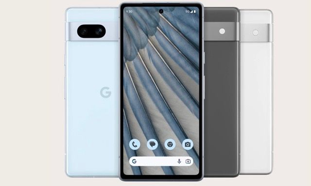
Google released an article called ”Enhanced accessibility makes Google Pixel phones better for everyone.” It made me wonder, how accessible is the Google store where these phones are purchased?
Part of an on-going series where I offer free accessibility consulting for brands that use accessibility in marketing, but are they doing the work?
Keyboard navigation
Not everyone can use a mouse, many users operate the web using keyboard only. This could be for a variety of reasons like having parkinson’s. Navigating with a keyboard on the top menu, the focus styles are pretty much invisible. Notice if you can spot this very slight change to blue as a user moves through the menu.
Definitely impacting WCAG 2.4.7 and hard to notice especially with low vision. This could easily be fixed by improving this styling to something more visible.

Video description - a user on desktop navigating the Google store in the UK with a keyboard. Highlighting differences in style as a user lands on links and buttons. It's unclear visually due to poor styling.
Heading structure
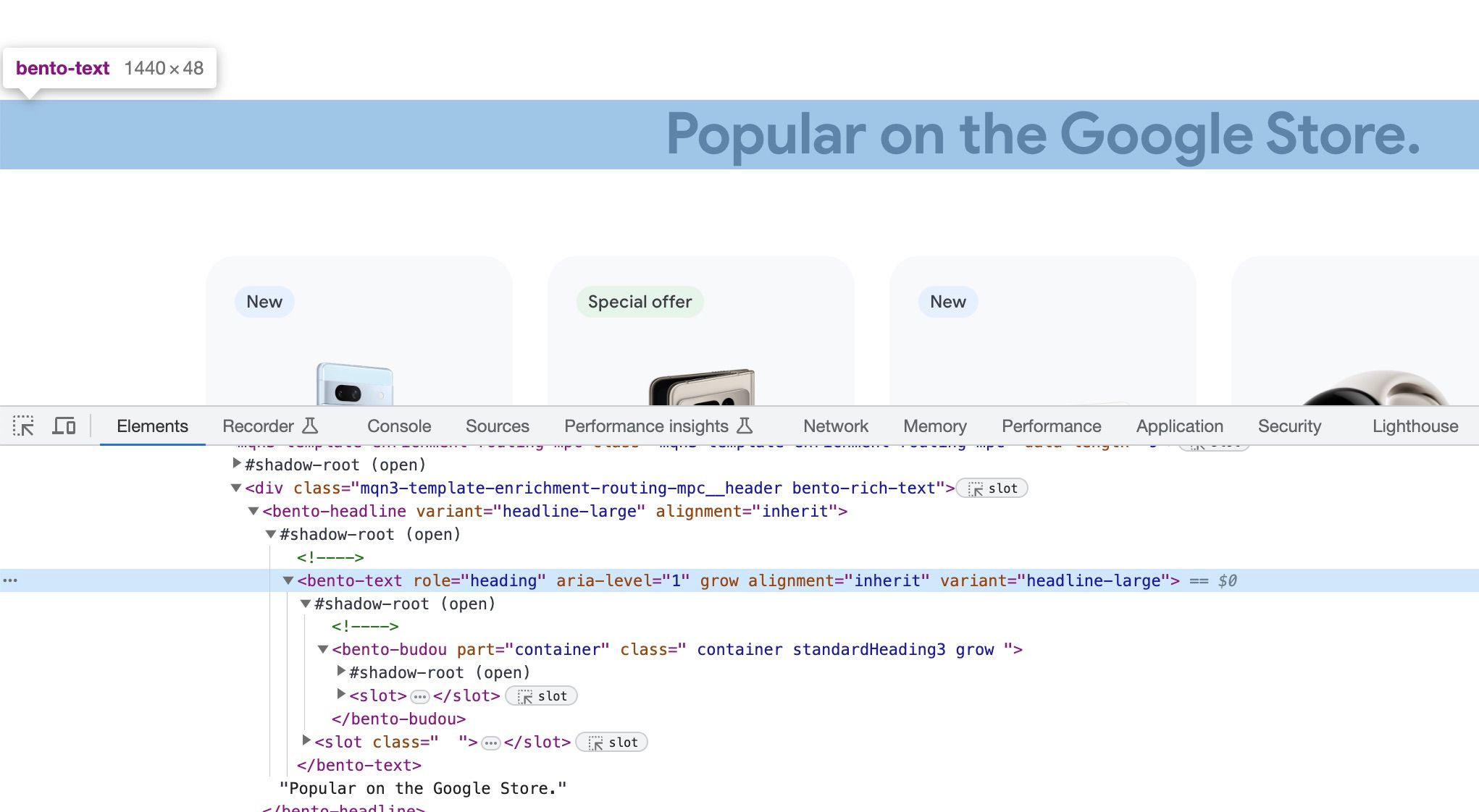
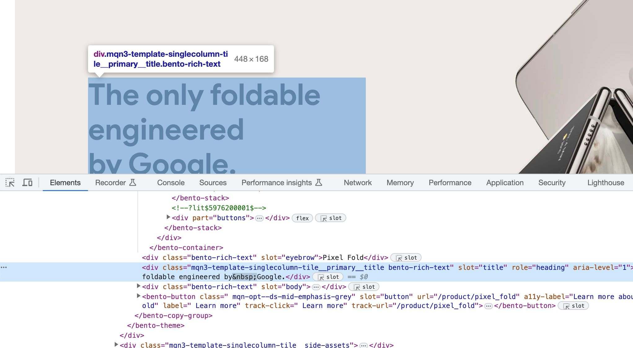
There seems to be a technique to use aria-level to artificially denote headings, however there seems to be over ten aria-level="1" on the page. I really wouldn’t expect so many h1s on a single page. There are some are aria-level="2" and for others they seem to have forgotten to add the relevant heading level.
<bento-text
	role="heading"
	aria-level=""
	grow=""
	alignment="inherit"
	variant="title-large"
></bento-text>
The code above highlights missing heading levels on the Google store

This impacts WCAG 1.3.1 and 2.4.6. Headings give a document a structure and help people navigate it and understand the content hierarchy. This helps all people but is especially important to those using screen readers; they rely on these to understand the hierarchy of the information.

Link purpose
“Read more” links are commonly used on websites, but they aren’t very descriptive when read outside of their surrounding context. This isn’t a problem for the majority of users on the web, but viewing links outside of their surrounding context is very common for screen reader users.
In this context Google has gone with “Read article” - they could have just added a link to the text above, this impacts WCAG 2.4.4 Link Purpose (In Context).

Code errors
There are also some simple code errors that can easily be fixed:
<span aria-label="Go to empty shopping basket"></span>aria-label attribute cannot be used on a span with no valid role attribute.
<div part="container" class=" container " role="generic"></div>Role must be one of the valid ARIA roles: generic.
The post Listen To Me And Not Google gave me the confidence to call out some of these issues.
Hire
A quick review of the homepage but it’s clear the Google store has more work to get it to a place where it meets WCAG 2.1 AA standards as is as accessible as it could be. A 2023 WebAIM report noted that 96.3% of home pages had detected WCAG 2 failures.
I’m Chris, a UX Developer with a focus in accessibility, available for hire.
Reach out on LinkedIn
