Give me a solid Figma file over a Photoshop file any day. It’s still the best tool for Design Dev handover. I’ll root for the company, use the product daily, this isn’t a binary world where praise means silence when a company gets things wrong. This week, Figma got it wrong.
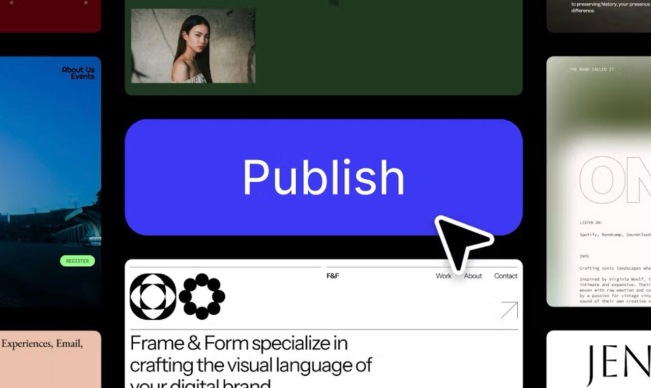
Figma launched Sites, it’s new website builder, this auto-generated code, drag-and-drop design thing. It promised to let designers publish directly to the web. The vision? Empower designers. Cut out the noise, the Devs. Ship faster. But the reality? A broken, unfinished product that wasn’t ready.
Figma has grown from startup to a design juggernaut, valued in the billions, it was set to be acquired by Adobe, but regulators slapped that deal down citing concerns over monopoly. And rightly so, Adobe’s recent history hasn’t exactly screamed user-first.
So here comes Figma, with millions of users, launching a new product but it’s not just flawed, it’s dangerously misleading. But “we live in the real world, there’s no time, no budget” Ok sure, when but does this not become true? When revenue is 1 million, 20, 100, a billion?
Auto-generated code isn’t new, but this is worse
We’ve seen this story before, decades ago: PowerPoint “Save as HTML”, Dreamweaver, FrontPage, even Word’s “Publish to Web”, Framer. Auto-generated code that looks okay but underneath? A mess.
This isn’t just about bad code, that’s expected in this type of product. The deeper issue is the positioning, the marketing: this was launched as if it was ready. Without caveats. Without disclaimers. No “beta” banner. No loud warnings. No asterisks. Not even a mention on-stage. Just: “Go live.” This should have been a demo of an alpha.
This is worse as Figma has the ears of millions of Designers, including thousands of juniors, telling them that they can ship production-ready sites without a Dev, without understanding semantics, accessibility, or performance. That looks matter more than function. That developers don’t need to be involved at all. That disabled users don’t matter.
It’s miseducation
Also there’s a culture around launches like this. You’re not supposed to criticise. Don’t moan. Don’t be negative. Get on board. Be part of the vision. Trust the process, let me feel good about these vibes. Here’s the problem with that mindset - it kills valid feedback. It rewards performative progress. It silences real concerns from people.
UI is not a printed poster, digital design has constraints. Frontend has a structure, a skeleton, it’s an accessibility tool. When this is ignored, the site doesn’t just fail to meet standards, it excludes people. They’re literally cut out of the digital world.
Tom gets on stage, says he has 30 years as an expert building as a Design and Dev hybrid and just happily presents the product. No warning, no disclaimer, no “not production-ready” flag or a banner. Not even a hint on stage. Also, they’ve been silent in response to critique, it tells us whose voices matter. It says criticism will be ignored. That marketing matters more than impact.
Thousands of small businesses and Designers will most likely launch sites with this tool. Some might even sell these sites to businesses. Those sites won’t meet standards, they’ll be inaccessible and those businesses will never know.
- Why not launch as a demo product?
- Why not a gated alpha?
- Why not a banner: “This is not production-ready. This is experimental.”
- Why not a massive dialog: “This is not accessible. This is a demo product, this does not comply with the EAA”
- Why not just do a demo without a launch?
I could get on board with this, a starting point, a demo, an experiment - but with clear education.
A pattern we’ve seen before
This isn’t just about Figma, it’s this wider trend. Businesses launching AI tools and LLM wrappers as if they’re mature, finished products. Even Apple, famously last to the party until done right, launched AI features that were clearly unfinished. Everyone’s rushing to be first. Quality? I don’t know her.
This isn’t anti-Figma, Figma has the eyes of the design world. They have reach, influence, power. They could have used this moment to lead, to educate. To show how auto-generated code can be used as a baseline. How accessibility is important, even a demoed screen reader demonstrating the problem with the code. Instead, they shipped hype. They pretended something was polished.
Do better
Build the guardrails. Add the disclaimers. Involve developers. Respect accessibility. Put all users first. Because if the biggest design tool in the world doesn’t care about the fundamentals, why should anyone else?
