Part of an on-going series where I offer free accessibility consulting for the homepage of major brands. Companies talk about inclusion but are they doing the work?
Fenwick is an independent chain of department stores in the United Kingdom, let’s dive in.
Starting off, the company doesn’t have an accessibility statement. Having a dig around in the FAQ there is some talk about accessibility of their physical stores but nothing about the website.

Colour contrast
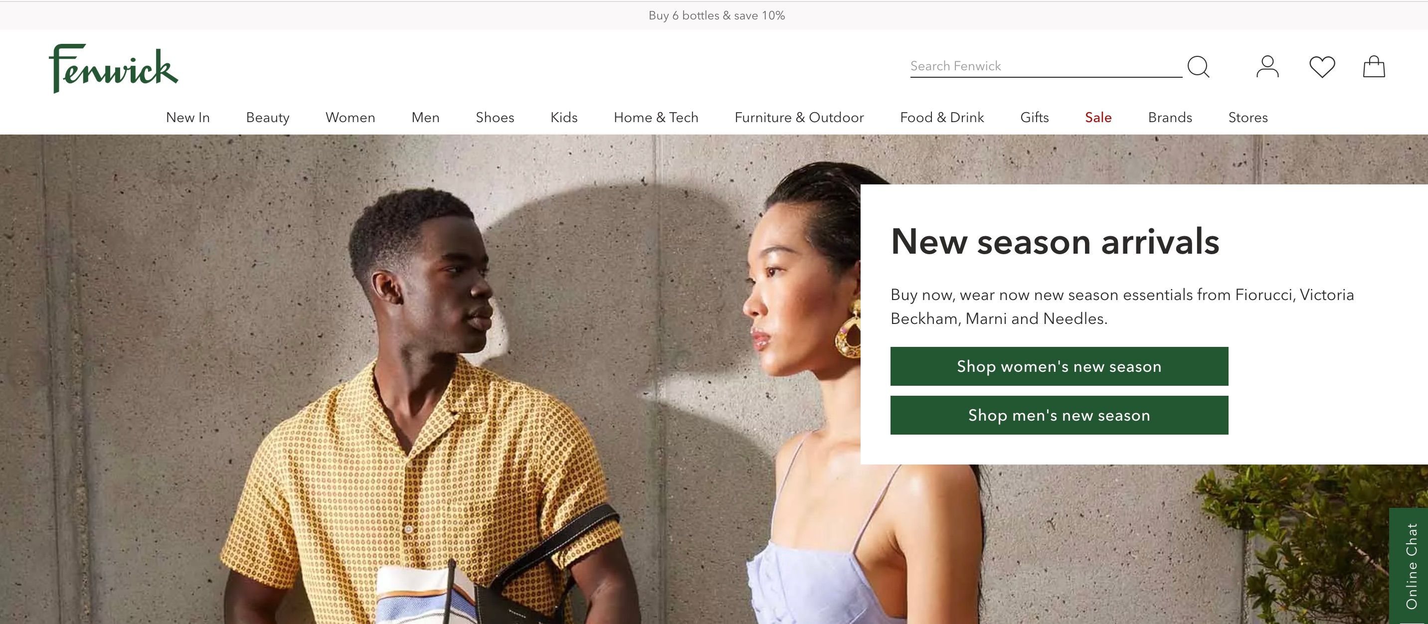
The search bar placeholder copy fails colour contrast checks. This text that reads “Search Fenwick” is not clear to read. This impacts low vision and blind users and WCAG 1.4.3. This has a simple fix, darken the grey.

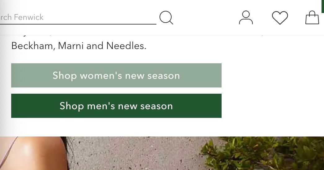
There are also some problems with the hover styles. On these buttons the text is not readable.

Keyboard navigation
Not everyone can use a mouse, many users operate the web using a keyboard only. This could be for a variety of reasons like arthritis. Navigating the Fenwick homepage is impossible. There are no focus styles, Fenwick seems to have removed them. In the video below navigating around the page a user has no idea where they are. This is the mouse equivalent of removing the cursor.

Video description - a user on desktop navigating the Fenwick.co.uk homepage with keyboard, the focus styles don't exist. It's not possible to navigate the site using a keyboard.
Focus styles usually present by default as a blue outline, looking a bit deeper they’ve been removed on purpose. This is a fail of WCAG 2.5.7.
// Fenwick

base.css a,
button {
	outline: 0;
}
Additionally a user can’t navigate into the mega-menu, it does not work with a keyboard. Using the esc key to close the menu does nothing. Fail of WCAG 2.1.1.
Alt text
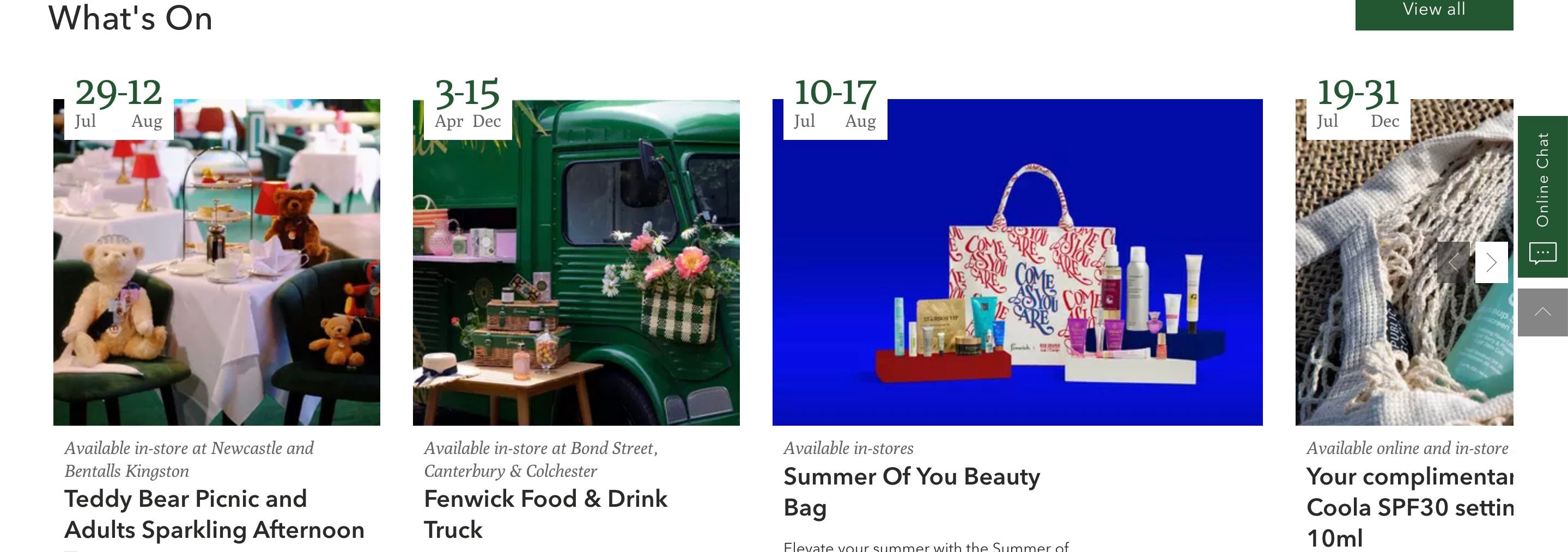
An accessibility basic, does the images have text alternative? This provides information to low vision and blind users. Fenwicks has some alt text on a couple of images but they’re missing a lot of them including the “What’s On” section below. This impacts WCAG 1.1.1.

Link purpose
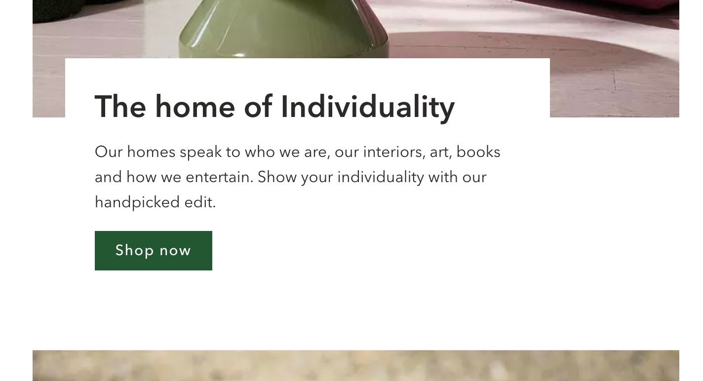
“Read more” links are commonly used on websites, but they are not very descriptive when read outside of their surrounding context. This isn’t a problem for the majority of users on the web, but viewing links outside of their surrounding context is very common for screen reader users.
In this context Fenwicks has gone with “Shop now” - this impacts WCAG 2.4.4 Link Purpose (In Context).

Hire
A quick review of the homepage but it’s clear Fenwick has more work to get it to a place where it meets WCAG 2.1 AA standards and is as accessible as it could be. A 2023 WebAIM report noted that 96.3% of home pages had detected WCAG 2 failures.
I’m Chris, a UX Developer with a focus in accessibility, available for hire.
Reach out on LinkedIn
