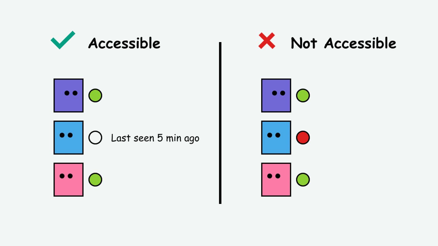
Don’t use colour as the only way to tell people something important. Colour is not used as the only visual means of conveying information, indicating an action, prompting a response, or distinguishing a visual element.
Why is WCAG 1.4.1 important?
There are various eye conditions that mean people see colours in different ways. This includes various types of colour blindness, some people need high contrast, some people need low contrast, there’s a whole spectrum of people that might see the world differently.
Web Content Accessibility Guidelines (WCAG) 1.4.1 means by not relying on colour alone within a Design,
Let’s give an example, what’s the problem with these links?
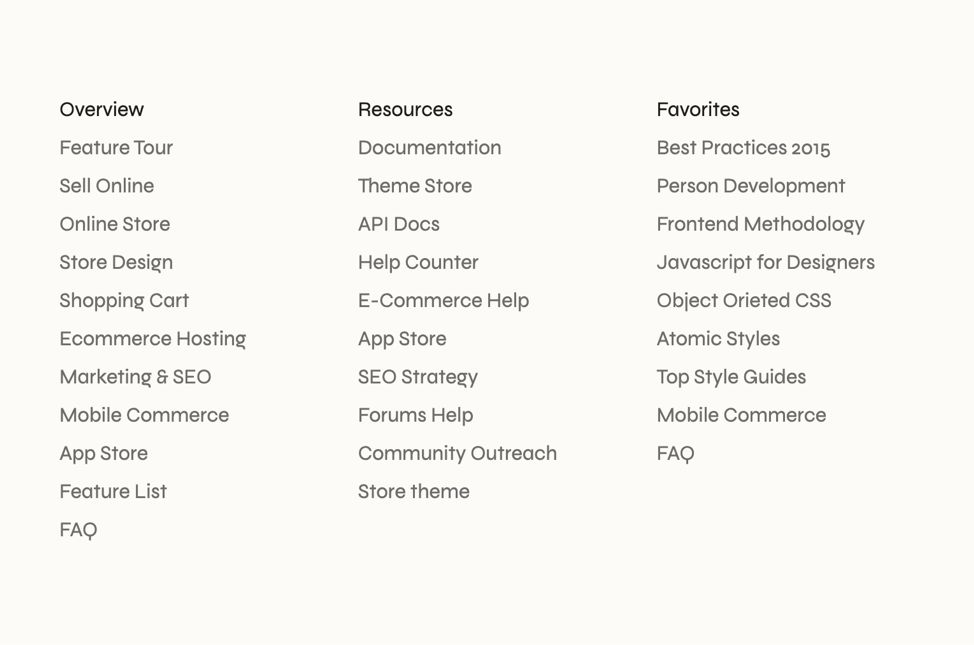
Only colour is communicating what is a heading and what is a link. In this example “Overview” is a heading but the rest are links, all the spacing is the same, the font size and weight is the same. Meaning what is a link and what isn’t is harder to determine.
Below is what someone with blurred vision might see.

Someone with cataracts, glaucoma, age-related macular degeneration might see reduced contrast. Notice how the contrast is harder to see so the colour difference of what’s a link and what isn’t makes less of an impact, it’s less noticeable.

Achromatopsia, is one type of colourblindness in this context the colour is stripped this is what this person might see.

The solution to WCAG 1.4.1 is to add a second visual cue. Colour is not used as the only visual means of conveying information.
In this example, the links or headings need to have a second visual cue. Often links as historically blue and underlined. The blue colour lets sighted users know it’s a link, but the underline provides that extra visual cue for people who might see colours differently.
Historical fun fact, the creator of the blue link chose it because he liked blue and it was partially down to the fact that screens at the time could also show a small amount of colours, so they could have easily been green or something else.
How to meet WCAG in this context?
So, for links to be accessible, you need to ensure they are:
- Distinct from other text, they shouldn’t blend in with the surrounding text.
- Identified by more than just colour, they need a non-colour visual cue.
Underlines are typically the best, easier and simplest solution to this problem. More on this in a moment, however underlines are not the only solution to this problem. WCAG often describes the problem rather than a set of solutions.
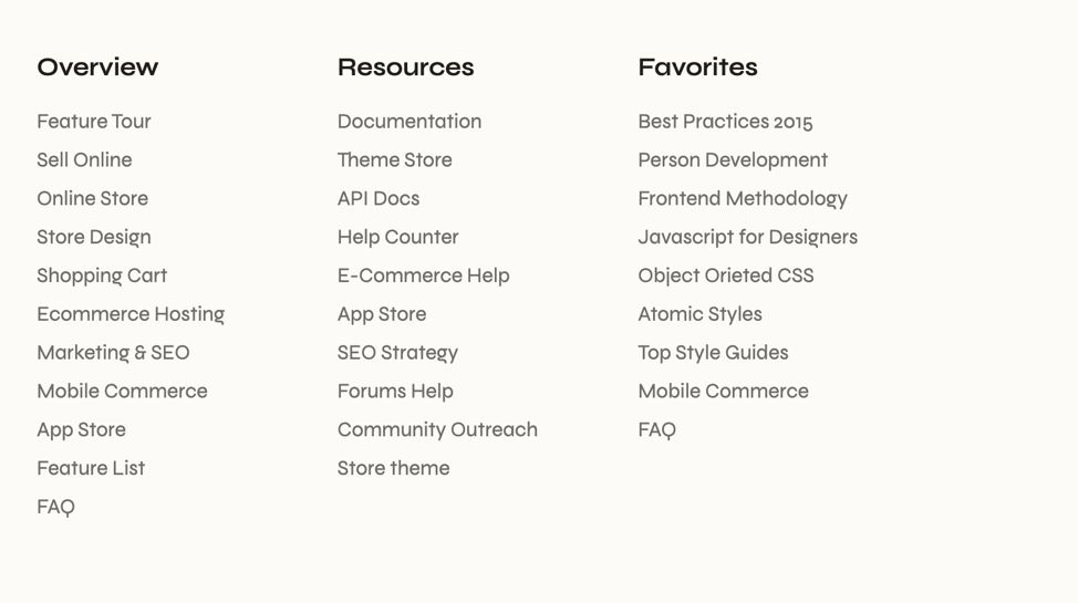
Solution 1 - change of size and shape
In this solution the headings are made bigger, bolder and there is more spacing between the heading and the links. This ensures that 1.4.1 is met and more than colour is being used to determine the difference. The headings are very clear and they are different. Not as good as it could be but still works.
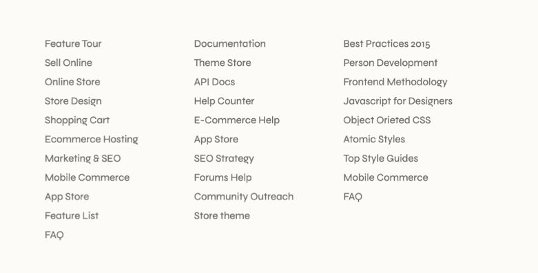
Solution 2 - remove the confusion
Another solution is to remove the headings entirely, this way there’s no confusion at all, all of these are links due to the positioning.
Solution 3 - underline the links
The most simple solution is to add an underline to the links, this sticks with a known convention.
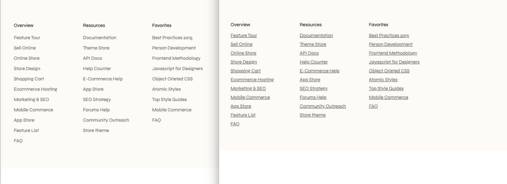
Solution 4 - style the underlines
Don’t like the way those underlines look? How about giving the underline more breathing room, along with a reduced opacity to make it more subtle?
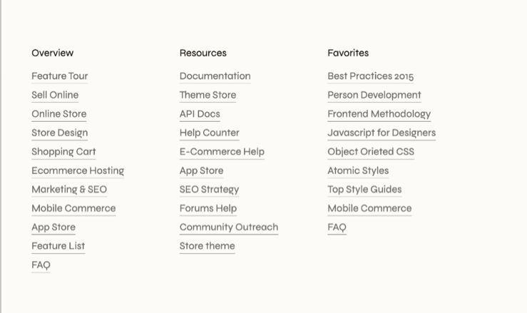
Solution 5 - what about overlines instead?
Don’t like underlines at all, how about overlines, so lines on top? A bit more unconventional, however still manages to comply with WCAG 1.4.1
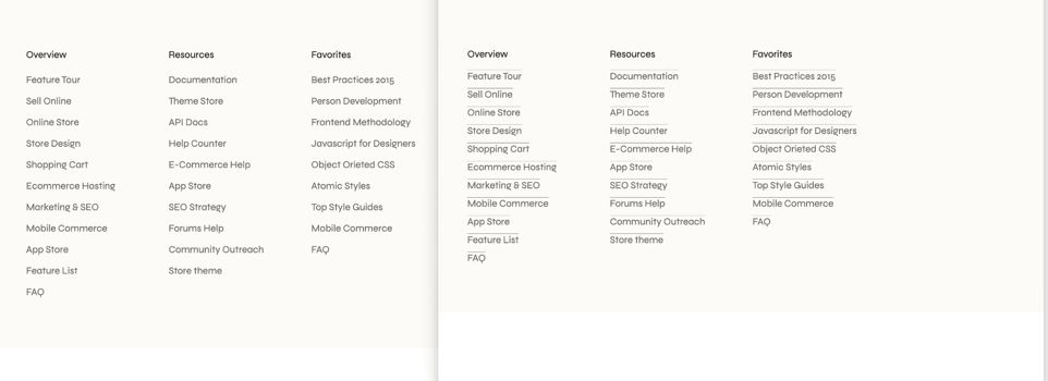
Solution 6 - how about an icon?
Don’t like the overline, how about an arrow icon or shape so that the links are clearer?
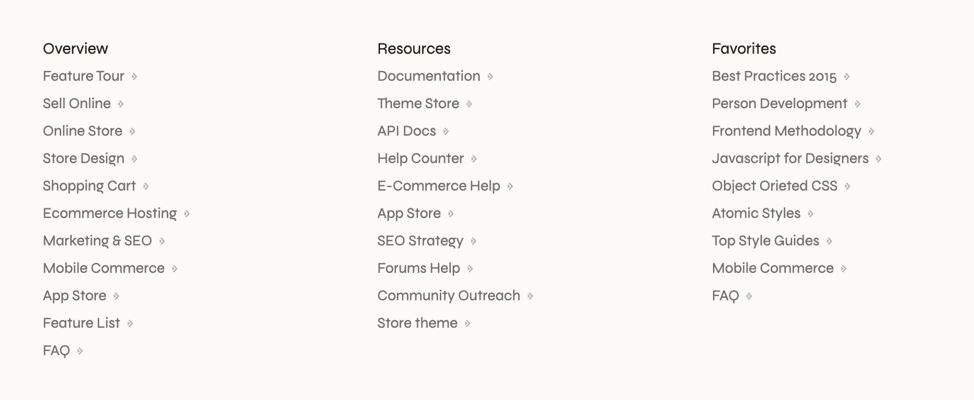
Those were 6 Design solutions that take the WCAG constraints and implement a creative Design solution. There’s probably 100s more that could also work.
I personally prefer adding a border, an outline, or an underline, or increasing the thickness of the text (or a combination of any of these) to highlight the active link. - Sara Soueidan
“It is amazing to me how this suggestion causes so much angst and fighting. Designers often argue that they look ugly, some users claim they are distracting, others even claim they reduce accessibility.” - Adrian Roselli
This is where some designers bristle. If there are a lot of links on a page, it could look awfully cluttered with underlines. That’s why some designers would rather remove the underline completely - Jeremy Keith
But I don’t like any of these it spoils the vibe…
Look I get it, there’s a layer of what visually looks good, feels nice. Some argue that underlines create visual noise, making the design look cluttered or less sophisticated. Change can be difficult.
For many users, a lack of an underline is even more distracting. They have to scan the entire section, mentally hover over each piece of text, or rely on a slight colour difference to figure out what is clickable and what isn’t. This mental effort is called cognitive load. An underline eliminates this problem instantly, making the section scannable and reducing frustration.
The problem is what one person sees as “visual noise” is, for another, a vital, expected cue that makes the page easier to use. This is when WCAG comes into play, to make things more detailed. A set of international technical standards that move away from opinion.
I’ve done a lot of audits in the first half of this year and at this point a believe that designing links without underlines is a kink. The idea that users don’t understand that links are clickable arouses some designers. I can’t explain it any other way. - Manuel Matuzović
This is often the crux of this argument, there is an aversion to change due to aesthetics, meaning it looks nicer to some people. However this goes back to the concept of Design. Design is about function first. Something can be beautiful first and lack function.
Function first, beauty second
This watch (below) is beautiful, it might be the perfect choice for a photoshoot, for an Instagram profile picture or something where the goal is visual aesthetics.
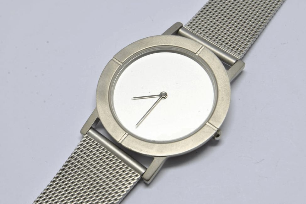
However, if the goal is to tell the time, consistently, reliably, this design choice fails as it’s much harder to see the numbers
Most people aren’t typically visiting most websites to admire the website. Typically they are trying to do something, they are trying to get in and get out. They are trying to find some information, buy something, contact someone, get something done. It should be usable, accessible, first and beautiful second.
What’s another example?
Notice how the text adds a secondary visual cue to inform the user whether someone is online

Some more amazing examples can be found on Access Guide
Further reading
- Don’t use color alone to convey information (colorblind)
- Well Color Us Surprised—This SC Can Be a Tricky Customer
- Do not rely on colour alone
- WCAG in Plain English
- What about the G183 loophole?
- Colour alone can be used to convey meaning, and I don’t like it!
Want more simple, actionable tips? I’m Chris, a UX Developer with a focus in accessibility, available for hire.
