Part of an on-going series where I highlight basic HTML and accessibility errors found on the homepage of brands.
Vonage offers flexible and scalable voice, messaging, video and data capabilities across Unified Communications, Contact Centers and Communications APIs.
Starting off, the company doesn’t have an accessibility statement. Having a dig around in the careers page there is some talk about disability, however you have to contact them for their equal employment opportunity (EEO) policy.
It looks like Yinon Oved (Software Engineering Manager) wrote a piece about: How to implement web accessibility back in late 2021 encouraging best practice.
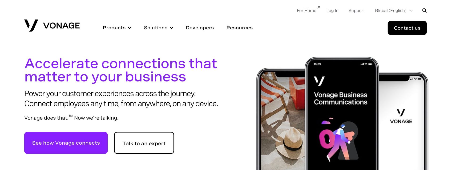
Diving in, reviewing the homepage. Starting off you have this chatbot that pulls focus instantly away from a user. Screen readers have no idea where this has come from and how to interact with it. Not great.
Heading levels should only increase by one
Vonage starts with “Accelerate connections that matter to your business” as a h1 and then jumps directly to h4. In the same way that sighted users can glance at a page and get a sense of its contents, users of screen readers can do the same by navigating through headings. Well written and properly ordered headings can save users, especially those who use screen readers, a lot of time and frustration. This fails WCAG 1.3.2.
Missing HTML landmarks
Vonage have also missed using the HTML element main.
In HTML5, elements like header, nav, main should be used. By using landmark elements, you make the webpage more robust and functional no matter what screen reader technology is used.
Link purpose
Vonage have gone with “Learn more” links but they are not very descriptive when read outside of their surrounding context. This isn’t a problem for the majority of users on the web, but viewing links outside of their surrounding context is very common for screen reader users. This impacts WCAG 2.4.4 Link Purpose (In Context).
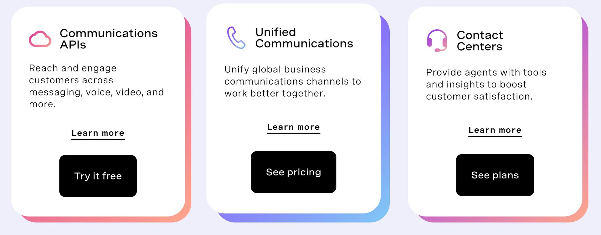
Additionally there is a a button with the content: “Try it free” but semantically this is actually coded to be a link visually altered to look like a button. This impacts WCAG 1.3.1
Misuse of aria
There is quite a lot of misuse of aria on the Vonage homepage.
<a
	class="link"
	href="/communications-apis/"
	target="_self"
	aria-label="go to the communications apis pages"
	>Learn more</a
>
In this context, sighted users will see the text “Learn more” while a screen reader will say: “Go to the communications apis pages.”
Bad ARIA practices often leads to even worse accessibility.
In this code below, they have decided to add a role of presentation incorrectly, this removes the image semantics of the img element. It’s very similar to using none. This fix is simple remove the role attribute from this element.
<img
	src="/content/dam/vonage/us-en/brand/logos/Vonage_V_Logo_Black.svg"
	data-assetref="Vonage_V_Logo_Black-1657560819355"
	alt="Vonage V Logo"
	role="presentation"
/>
Another example of misuse, they’ve attempted to label the entire card “go to the omdia report” when in fact it’s not needed. The inner copy should provide the details of what the link contains.
<a class="Vlt-card-image Vlt-card-image--variation" href="/about-us/awards/omdia-cpaas-universe/" target="_self" aria-label="go to the omdia report">
Problematic skip link
Vonage have attempted to use a skip link however they’ve also altered the focus order of this link by incorrectly adding tabindex="1". This has taken this link out of the normal flow and a keyboard user cannot get to it. This fails WCAG 2.4.3.
<a class="skip-to-main sr-only" href="#main-content" tabindex="1">Skip to Main Content</a>Distinguishable
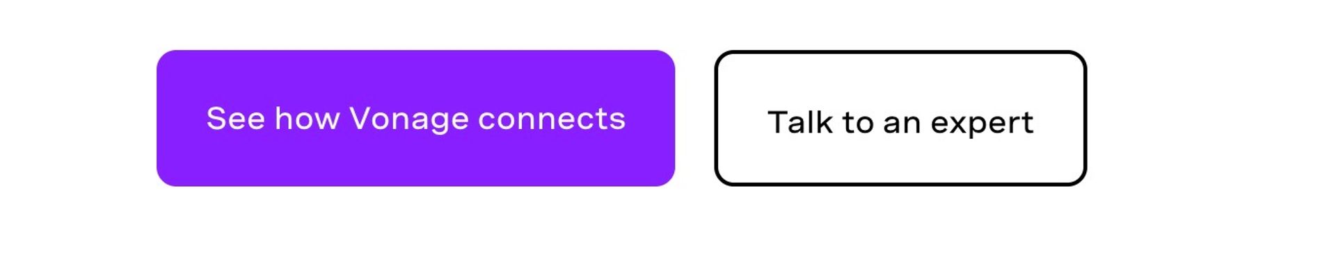
Many of the call-to-action buttons don’t have a hover state, additionally the focus state is hard to see. This fails WCAG 1.4.13
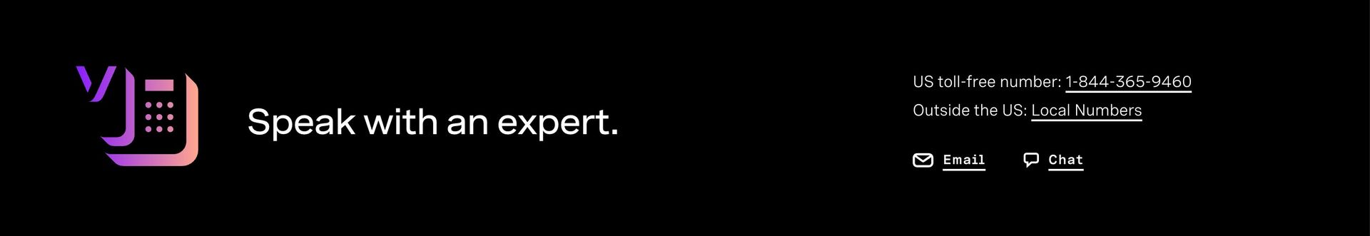
The lack of hover state continues further down in the expert section with all links missing a basic hover style.
Misuse of title attribute
In some of their client logos, they’ve added a title and an alt text as well as adding the word logo, this isn’t required it adds a lot of redundant noise.
alt="Domino's Pizza logo" title="Domino's Pizza logo" loading="lazy">This can be altered to look like this:
alt="Domino's Pizza" loading="lazy">The European Accessibility Act
The European Accessibility Act (EAA), which will come into force on June 28, 2025 is a law designed to create equal access for Europeans with disabilities by requiring a mix of products and services to be accessible. This will impact private companies should they wish to operate in the EU.
Hire
A quick review of the homepage but it’s clear Vonage has more work to get it to a place where there are no HTML errors. A 2023 WebAIM report noted that 96.3% of home pages had detected WCAG 2 failures.
I’m Chris, a UX Developer with a focus in accessibility, available for hire.
Reach out on LinkedIn