Part of an on-going series where I casually roast offer free accessibility consulting for the homepage of major brands that talk about inclusion but are they doing the work?
Allbirds, is a New Zealand and American company that sells footwear and apparel. Let’s dive in, reviewing Allbirds.co.uk
First off, the company starts strong - they have an accessibility statement, however nothing about WCAG, nothing about known issues. Simply a generic statement:
…committed to making our website’s content accessible
What does that mean? How committed? When was the last accessibility audit? Additionally, there’s this whole section about if it’s a 3rd party it’s not our problem. Technically it is - but we’ll park this for the moment.
Reviewing the menu
First off, the menu uses UPPERCASE text. This is not great for those with cognitive issues like dyslexia. However it’s coded with CSS styles so that’s a partial improvement.
Next, there seems to be this mix of using links and buttons interchangeably which impacts WCAG 1.3.1.
It’s not visually clear to the user if they’re going to be directed to new page or open the mega-menu. As a user lands on “Kids” the style changes as it’s a link, there is only a very subtle visual change.

Video description - a user on desktop navigating the Allbirds.co.uk menu with a keyboard. Highlighting differences in styling as a user lands on links and buttons. It's unclear visually which is a link and will direct to a new page and which is a button that will open the navigation menu.
Navigating with keyboard
Not everyone can use a mouse, many users operate the web using a keyboard only. This could be for a variety of reasons like having multiple sclerosis (MS). When the large mega-menu opens it’s not easy to navigate into this. There is an announcement that says expanded but doesn’t indicate this relates to the menu.
Should I select men’s and open the menu related to this section, I would expect the next interaction to go inside this menu. Instead, a user has to navigate to the end of the entire top menu to access this and get inside.
Additionally, should a keyboard user navigate to the end of mega-menu, rather than start at the beginning - the focus spills over into the rest of the page. Elements that are behind the menu on the page get selected, the user totally loses focus - impacting WCAG 2.1.
Focus styles
The focus styles around the links could do with some improvement the black outline is not clear due to the background image impacting 2.4.11. Additionally these are links not buttons, impacting WCAG 1.3.1.

Video description - a user on desktop navigating the Allbirds.co.uk homepage with keyboard, the focus moves from "Shop Men" to "Shop Women". These focus styles are not clear to a user due the black outline's interaction with the background image.
This continues on the homepage on sections, the focus styles are hard to see.
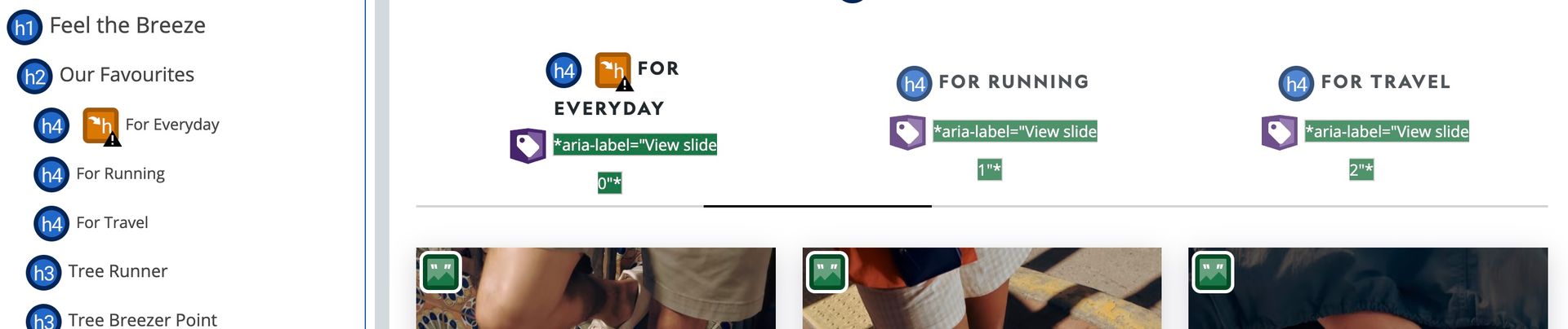
Heading structure, logical order
Taking a look at the heading order, the homepage jumps from h2 to h4 impacting WCAG 1.3.1.
There also seems to be some misuse of aria-label. The heading says “for everyday” but a screenreader will hear “View Slide 0”
Reviewing the links order
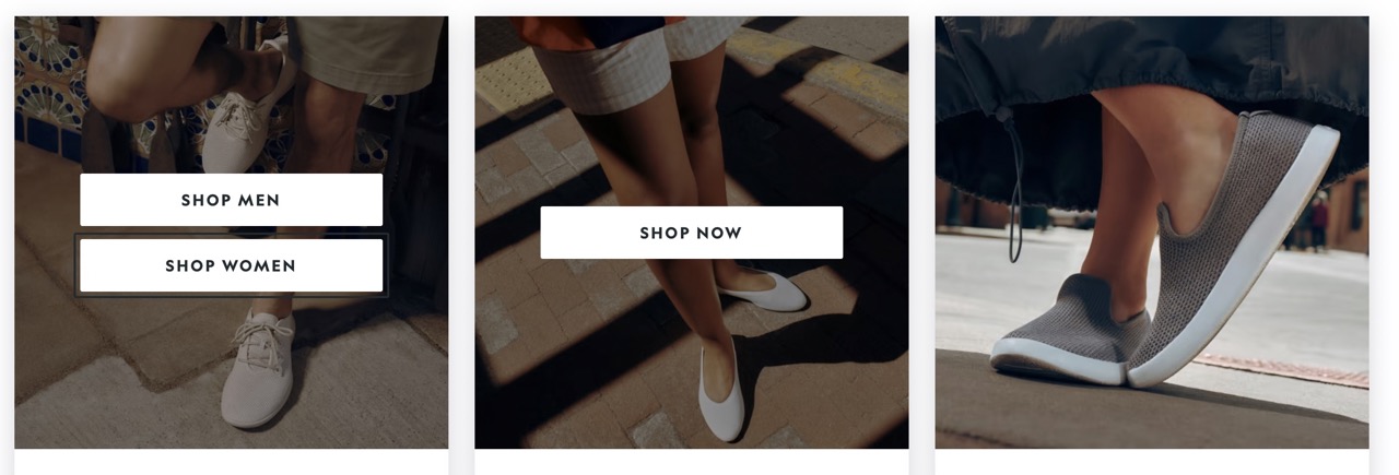
There are also some links at the top of the page that have no hover state impacting WCAG 1.4.13. There is also a button in this section that uses a chevron icon - however it has no text or a label, a screen reader hears “button” with no other details of what this does.


Colour contrast
Taking a look a bit further down the page there an email sign up however the placeholder fails colour contrast checks, the text is not really readable. This impacts WCAG 1.4.11

Robust
I’m pretty sure I know the answer to this, but let’s turn of JavaScript to check how robust the site is. As expected, the entire site fails to load. There are many reasons why JavaScript might fail to work.

Missing alt text on images
The homepage has a lot of images that are missing alt text impacting WCAG 1.1.1. Sometimes there’s an argument made where someone is like “its decorative” - if that was the case you would be able to remove it and it wouldn’t matter to sighted users. I’m pretty sure the main image is deemed important.
Hire
A quick review of the homepage but it’s clear Allbirds has more work to get it to a place where it meets WCAG 2.1 AA standards as is as accessible as it could be. A 2023 WebAIM report noted that 96.3% of home pages had detected WCAG 2 failures.
I’m Chris, a UX Developer with a focus in accessibility, available for hire.
Reach out on LinkedIn