While at GOV.UK I got the opportunity to watch a renowned Accessibility Specialist test with Dragon.
Dragon is voice control software that allows a user to interact with a computer using just their voice. Not everyone uses a mouse or even a keyboard to interact with websites. Some people use voice control.
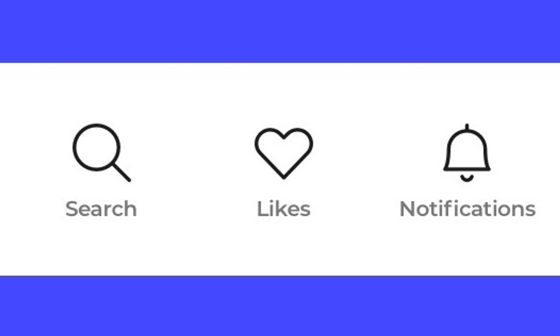
A key-takeaway was to always add text to icons and iconography in UI designs, this benefits voice control users. When there is no text, a user can easily misread or misunderstand what an icon means and struggle to select it.
Take the following Design below, a user might say “select love” or “select heart” and they would receive no feedback. Nothing would be selected.

However, with the following updated Design, the user can easily see that the heart icon is called “Likes”. Should they then say “select likes” they can easily navigate through the application without having to guess their way through.

It might seem like a small change, but easily has a tangible impact on an experience for some users.